If you have ever approached Termini station in Rome, you may have noticed a frieze on the edge of the slender canopy. It is quiet and subtle, a discreet touch of abstract ornamentation on the leading edge of a slice of otherwise unadorned and exquisitely mid-century modernism.
Think back to The Godfather Part II, and you may remember a silent, unsettling character who acts as bodyguard and hitman for Michael Corleone. Seen wearing only a black hat and black rollneck, the taciturn assassin cuts a sinister figure. He was played by Amerigo Tot (1909–84), a Hungarian artist (he was born Imre Tóth), part-time actor and one-time Italian resistance fighter who was responsible for sculpting the frieze on the front of Termini.
There is something flamboyant about a frieze. It seems appropriate that Tot, who also appeared in Fellini’s Satyricon and Mike Hodges’ Pulp, should have had a sideline as an actor. But Tot’s frieze for Termini also gives the lie to the misconception that friezes somehow died out with the ancients and the neoclassicists who built the rest of Rome.
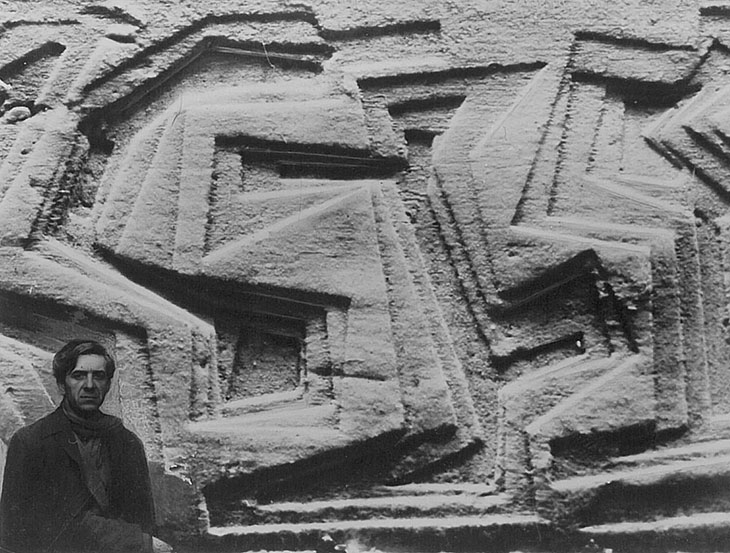
Photomontage of Amerigo Tot and the plan of his frieze for Termini station in Rome, created by Cosimo Boccardi in 1949. Photo: © Amerigo Tot Foundation
The frieze has been a recurring feature in the history of architecture. But it is also true that since the end of brutalism, sometime in the early 1980s, it has almost disappeared from modern architecture. The reasons for its disappearance seem obvious. The frieze originated in classical architecture with its trabeation (columns and beams) and decorated the beams above the columns and the tympanum within the pediment. Its appearances on Mesopotamian, Egyptian, Aztec, Mayan, Indian and African buildings suggest that architecture’s flamboyant hatband is an almost universal element. The frieze was the narrative element of the architecture, a sculptural strip that could be read for its mythical themes, or it could just act as decoration. The long controversy over the British Museum’s Parthenon marbles illustrates how the frieze transcends both architecture and art to become a medium in its own right. It can be understood as an artwork yet should probably be rooted in place in a particular architecture and location.
The conventional narrative is that modernism’s enthusiasm for stripping away ornamentation (and its abandonment of the classical norms of columns and pediments) spelled an inevitable death for the frieze but, as the example of Termini shows, this was far from the case.
After the historicist excesses of the 19th century, when elaborate friezes were applied to Greek and Roman Revival buildings as well as to new typologies such as the Royal Albert Hall or Louis Sullivan’s skyscrapers in the United States, the frieze came back in a big way. Art nouveau and Secessionist buildings sprouted fanciful friezes of leaves, vines, wilting maidens, tendrils and whiplash lines. Joseph Maria Olbrich’s Secession building in Vienna (1898) features a frieze of golden leaves, a graphic device that presents the building as a frontispiece for a new art movement. Olbrich had in turn been influenced by the British Arts and Crafts architects, notably Charles Harrison Townsend, designer of the Bishopsgate Institute (1894) with its faience tree-of-life motif.
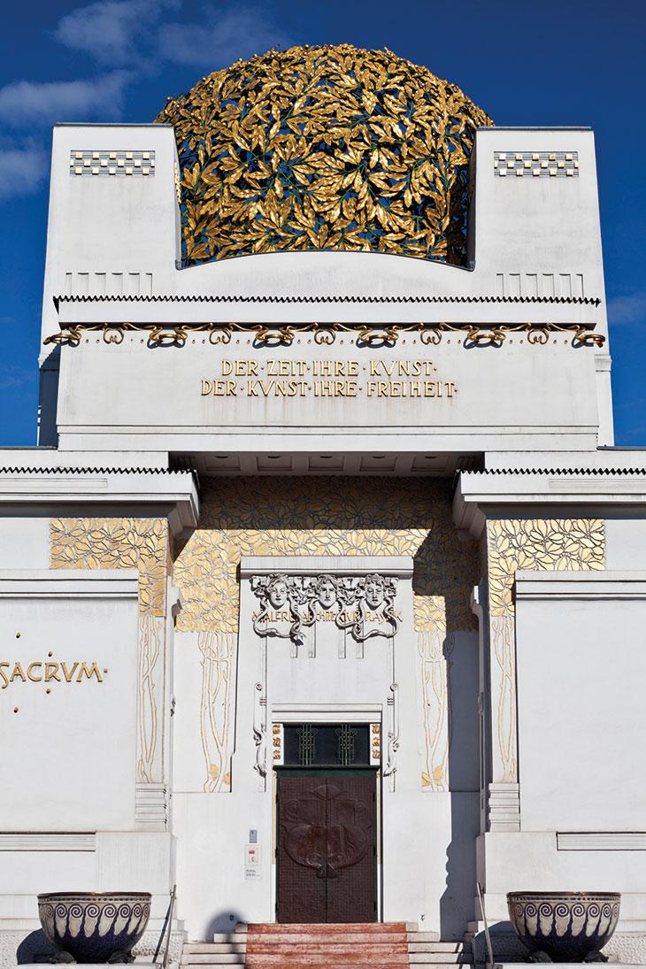
The Secession building in Vienna, built in 1898 and designed by Joseph Maria Olbrich. Photo: Arcaid Images/Alamy Stock Photo
The frieze found its apotheosis in the decadence of art deco, the exuberant expression of the Jazz Age and the subsequent, more sober responses to the Wall Street Crash of 1929. Stepped, Aztec-inflected towers, movie palaces and exhibition pavilions were crowned with layers of polychromatic motifs, acanthus leaves, rising suns, machine parts, scrolls and zigzags. The Chrysler Building (1930) features stylised tyres and hubcaps (so high up you can barely see them) and the darkly glamorous Richfield Oil Company Building in Los Angeles (1929) had its friezes picked out in gold to stand out against its oil-black cladding. You can still see the same effect in London’s only authentic splash of US deco, Raymond Hood’s and Gordon Jeeves’ Ideal House on Great Marlborough Street, another building from 1929.
The Depression didn’t halt the proliferation of the frieze. Cinemas, hotels, department stores and restaurants continued to use decorative strips and fascias to create a landscape of interest above the shopfronts, and the Works Progress Administration’s Federal Art Project in the US employed thousands of artists to create friezes and murals across the country. The buildings were mostly austere but enlivened by strips of vivid carvings with murals inside. With their scenes of powerful workers, agricultural abundance, technology, trains, cars and planes and with the occasional stylised eagle or wheatsheaf they often appeared unsettlingly similar to the socialist realist reliefs of the Soviet Union and the fascist friezes of Italy and Germany. A typical example might be Vladimir Shchuko’s workers in relief atop the Lenin Library in Moscow (1941), but we might also look at the Casa del Fascio in Bolzano, Italy, designed by Guido Pelizzari, Francesco Rossi and Luis Plattner and completed in 1942. The vast, ugly and stiff frieze The Triumph of Fascism has been a feature of the city ever since, but in 2017 it was overlaid by an LED-illuminated quotation from Hannah Arendt. The words ‘No-one has the right to obey’ are a riposte to the frieze’s ‘Believe, obey, combat’ and the foregrounding of words over images is a welcome relief from the fascist relief behind it. It is also, perhaps, a glimpse of the frieze’s future. The words that move across the facade of Christ & Gantenbein’s Kunstmuseum in Basel (2016) function as both frieze and signage. They also nod to Jenny Holzer’s unforgettable scrolling scripts resembling news feeds or Times Square news tickers.
Post-war reconstruction was rich in friezes celebrating the act of rebuilding itself. Renderings of workers stripped to the waist, cranes, machinery and women carrying buckets of cement can be found in sites from Coventry to Chernobyl. Many of the best are currently under threat, from the brutalist abstractions of William Mitchell in the UK to the crumbling works above museums and monuments in the former Soviet Union and Yugoslavia.
Yet despite the apparent favouring of LEDs and mute facades, friezes still pop up in curious places. Richard Deacon’s enjoyably garish work runs across the front of Eric Parry’s One Eagle Place building in Piccadilly, picking up how the colours of the LED advertising in Piccadilly Circus is reflected in rainy London streets. At the Olympic Village in Stratford, Niall McLaughlin turned the Parthenon marbles into a series of repeating friezes for an apartment block, to surprising and amusing effect. The contrast between the cast horses and warriors and the bikes and washing on the balconies is a constant source of visual delight. The frieze is not, perhaps, dead – just a little frozen. It will, surely, defrost again.
From the February 2021 issue of Apollo. Preview and subscribe here.



![Masterpiece [Re]discovery 2022. Photo: Ben Fisher Photography, courtesy of Masterpiece London](http://www.apollo-magazine.com/wp-content/uploads/2022/07/MPL2022_4263.jpg)
Suzanne Valadon’s shifting gaze