There’s an episode of The Simpsons in which Marge and Homer attend a fancy garden party (guests include Woody Harrelson, Lorne Michaels and Bill Clinton – the episode first aired in 1999). When they pull into the driveway of the host’s opulent mansion, Marge sees cursive text at the entrance and says, ‘Wow, look at this place! The house number is spelled out with letters!’ ‘Get used to it, honey,’ Homer responds. ‘From now on we’ll be spelling everything with letters.’
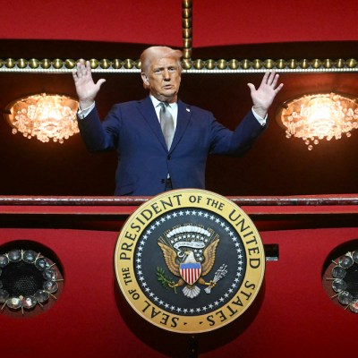
I can only imagine that Donald Trump had a similar thought when he learned that he would be moving back into the White House a little over a year ago. As well as demolishing the East Wing to build a ballroom that will allegedly hold 999 people, Trump has been spelling things with letters all over the place. The Oval Office, the West Wing, and the Hilton Hotel-inspired Presidential Walk of Fame have all been labelled in large gold-hued script. Now, the Rose Garden has received the same treatment.
The signs all use a typeface called Shelley Script, which is based on the handwriting of the 18th-century calligrapher George Shelley. Mergenthaler Linotype first issued Shelley Script in 1972. It was designed by Matthew Carter, an English-born American designer whose other typefaces include Georgia and Verdana. Despite its doubly English heritage, Shelley Script ‘seems to appeal particularly to America’, according to the digital font distributor MyFonts. It is popular for wedding invitations and vineyards, conveying as it does a certain old-fashioned, Waspy stiffness.
Carter was not just a designer, he is also Trump’s kind of entrepreneur. In 1981, he was one of the founders of Bitstream, the first independent digital type foundry in the United States. Copyright protections for typefaces often cover the name but not the design itself. Bitstream took advantage of this fact. Under Carter’s supervision, Bitstream released hundreds of designs taken from Linotype’s catalogue, as well as those of other foundries, and gave them new, uncopyrighted names – an act of which many in the world of typeface design have expressed disapproval. Helvetica became ‘Swiss 721’; Times New Roman became ‘Dutch 801’.
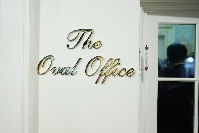
Along with the other Linotype designs, Shelley Script followed Carter to Bitstream, where he called it ‘English 111’. Bitstream was eventually bought by Monotype (who also now owns Linotype), and so the typeface is currently available to license, under its original name, for as little as £29.99. Comparing the Rose Garden sign with the same text simply typed on to a blank page in Shelley Script, it seems as though the designer – if there was one – made almost no adjustments. The spaces between the letters are as standard, leading to an ugly gap between the ‘T’ and the ‘h’ of ‘The’, which any professional should have adjusted. There is much less contrast between the thick and thin parts of the characters on Trump’s sign – but this is probably because otherwise the font would be much too delicate and weak to be made into signage at all.
Trump used a similar style of lettering in Mar-a-Lago. The Rose Garden itself also newly resembles the president’s Florida resort, its grass having been replaced by a limestone patio, dotted with tables shaded by white and yellow striped umbrellas. ‘We call it the Rose Garden Club,’ Trump told the loyalist politicians whom he hosted in the newly paved ‘garden’ in September last year. Brick by brick, Trump is turning the building some call the People’s House into Mar-a-Lago’s Washington outpost.
While showing off his bling new decor to Fox News’s Laura Ingraham, Trump described the walk of fame sign as ‘half-inch thick bronze carved by a very talented person’. A moment later, he corrected himself: ‘it’s brass, it’s pure brass’. There is, of course, no such thing as ‘pure’ brass, which is an alloy of copper and zinc. The segment is an apt summation of an administration so fond of ignoring facts and rewriting history. Tacky script signs and flashy accents might be in poor taste, but what about Trump’s presidency hasn’t been?
Zoe Guttenplan is a writer and book designer. She works at Literary Review.