From the May issue of Apollo: preview and subscribe here
At the new Whitney, the art begins in the elevators. Six in Four was created by the late Richard Artschwager, and consists of four elevator interiors reprising motifs that the artist explored throughout his career: door, window, table, basket, mirror and rug, rendered on a playful scale in plastic laminate, glass and etched stainless steel. To reach the galleries here, to arrive on the seventh floor to be faced with some of the most aspirational, audacious art of modern America, you have to step into an illusionistic artwork. It is as neat a visualisation one could imagine of how visiting any great collection ought to feel like venturing through the looking glass.
What is just as apt, though, is that this museum should have turned over an important part of its fabric to a new commission. Since its opening in 1931, the Whitney Museum of American Art has always made practitioners central to its activities, reflecting founder Gertrude Vanderbilt Whitney’s desire to support artists as part of her more general mission to promote American art. Indeed, that objective is entrenched in one of the collection’s early signature works, its jaunty and rather carefree portrait of Mrs Whitney herself in turquoise silk pyjamas, by the Ashcan school painter Robert Henri; it was painted in 1916, when she had already founded the Whitney Studio to assist and champion American artists.
The principle has long been reflected in the museum’s bold exhibition programming, and a collecting policy that keeps an eye firmly fixed on the future – facets that come together in the Whitney Biennial, its renowned invitational show of recent developments of contemporary art in America. In moving to its new location in the Meatpacking District of downtown Manhattan – not far from where Mrs Whitney opened the museum’s first home in four adjoining brownstones on Eighth Street – and into a capacious new building designed by Renzo Piano, keeping sight of this generous tenet has been imperative.
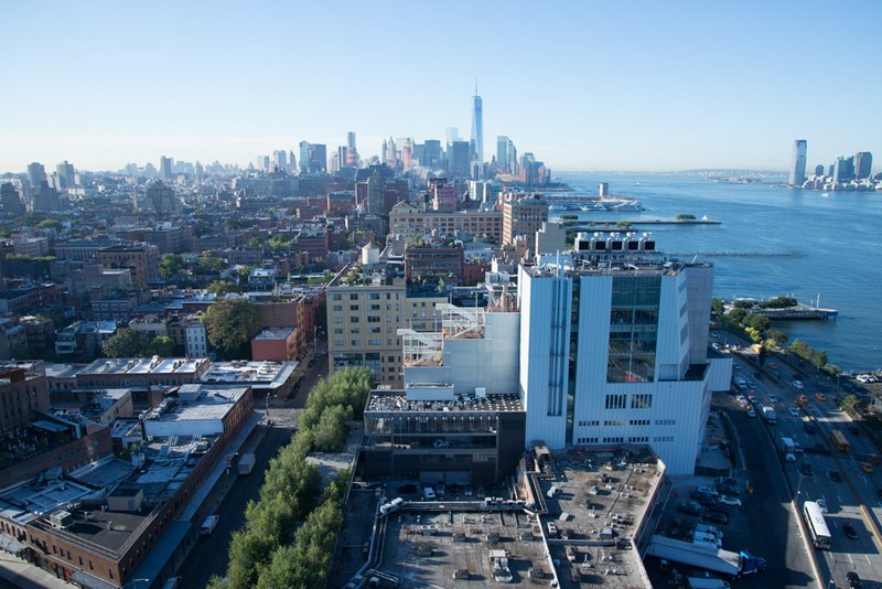
‘We created this building with the art at its centre,’ says Adam D. Weinberg, the Whitney’s blithe and charismatic director, ‘from the point of view of artists, from the point of view of the object. We created it from the inside out.’ And it’s true that, unlike many new museum buildings, this one doesn’t take on some outlandish form that would turn the structure into the main exhibit. Instead, it has an elegantly practical appearance: fronting the Hudson River to the west with a careful stack of box-like forms; and opening on to the city to the east with a series of stepped terrace galleries that take up the reclaimed industrial aesthetic of the High Line park below. It’s looking up at these that one gets a first sense of the building as a theatre of possibilities for artists, a concept that Weinberg enthusiastically endorses: ‘Artists could build on the building, they could project on it, they could do things outside it, under it, next to it. The whole idea is that the building can be part of the artist’s process.’
View of the new Whitney from The Standard hotel looking south, September 2014. Photo: Timothy Schenck

Inside, the sense of potential becomes more apparent, in immense gallery spaces that command four floors of the building, and include what is, at 18,000 square feet, the largest column-free gallery in New York. Visitors may have been fond of the Whitney’s old uptown home in the Breuer Building, but the museum had begun to feel shackled there, constrained by a lack of space and back-of-house resources. Major figures in the collection were often not represented in its displays, as Weinberg acknowledges: ‘Somebody could come to the museum and they wouldn’t see a single Edward Hopper, Alexander Calder or Agnes Martin – works that they associate with the Whitney.’ And the collection has grown considerably since the museum last moved in 1966, not just in terms of numbers (around 6,000 to more than 22,000 works), but also in terms of scale. As chief curator Donna De Salvo puts it, ‘Art-making itself has radically changed and expanded in that time’.
The collection is at the fore of the new Whitney, which has around 50 per cent more display space than its predecessor. The sixth and seventh floor galleries will be given over to rotating displays from its contemporary and modern holdings respectively; other new facilities, including an airy conservation lab and the museum’s first study centre for works on paper, feel as much like statements of its sincerity towards the objects in its care as they are laboratories for research and discovery. But the promise of relocation has already provided a spur for a great deal of productive research: coterminous with the building project has been the museum’s more understated, but perhaps no less ambitious Collection Documentation Initiative, in which curatorial staff have, says Weinberg, ‘basically re-examined every single work of art in the collection’, fully cataloguing and digitising its holdings.
The clear accord between the museum’s new habitat and its collection has already inspired a major gift, in the form of some 500 works from the collection of Thea Westreich Wagner and Ethan Wagner, many of which will be displayed here in the autumn in an exhibition co-organised with the Centre Pompidou. In the meantime, the opening exhibition, which has been installed across all the exhibition spaces of the new building, is an adventure into the museum’s existing holdings that somehow manages to be both grand and modest.
‘America Is Hard to See’ (until 27 September) presents more than 600 works by 400 artists, not as a comprehensive survey of modern and contemporary American art, but as a series of investigations – curated essays, if you will – over 23 thematic ‘chapters’. Its title, from a 1951 Robert Frost skit about the discovery of the New World, partly feels like a wry reflection on the museum’s own mandate: an institution that has a duty to map American art, however provisionally, but is ever reluctant, and commendably so, to circumscribe what might constitute that tradition. From this perspective, Glenn Ligon’s Rückenfigur (2009), among more recent works on display, might serve as the emblem of the exhibition. This neon, which radiates the word ‘America’ in reversed letters, tells of a place and its art that are more complex than the one we claim to recognise.
Plenty of old favourites feature in this inaugural display, of course, from Edward Hopper’s Early Sunday Morning (1930), with its uncannily bright dawn over a parade of anonymous shop fronts, to Alexander Calder’s Circus (1926–31), a wire fantasy world in which the artist himself played the impresario. Here are Jasper Johns’ Three Flags (1958), and Phil (1969), Chuck Close’s blown-up photorealist portrait of the composer Philip Glass, and groundbreaking sculptures by Eva Hesse, Nam June Paik and others.
Early Sunday Morning (1930), Edward Hopper © Heirs of Josephine N. Hopper, licensed by the Whitney Museum of American Art

But, as De Salvo tells me, sustained analysis of the collection has allowed for some curatorial curveballs, too, particularly in terms of how well-known movements have been presented: the ‘Rational Irrationalism’ chapter, for instance, explores minimalism and post-minimalism not so much through the sculptural installations through which Donald Judd, Robert Morris et al. made their names, as through the shaped canvases and reliefs through which several of these artists found their voices. The chapter titles are borrowed from individual works – ‘Large Trademark’ from an Ed Ruscha painting of the 20th-Century Fox logo from 1962; ‘Guarded View’ from Fred Wilson’s 1991 installation of four headless black mannequins decked out in the guard’s uniforms of different New York museums – and this also feels like a way of querying orthodoxies, as if each enigmatic heading were punctuated with a phantom question mark. ‘It’s great to have those moments where you have to scratch your head a little bit,’ says De Salvo, ‘where there’s a mystery, and a process of discovery.’
The uniforms in Fred Wilson’s Guarded View include that of the Whitney itself. Far more than most institutions, the collection features many works that contemplate or critique the museum, reflecting its close working relationship with artists. Distracting Distance, Chapter 16 (2010), for instance, a screenprint by R.H. Quaytman, reimagines Hopper’s A Woman in the Sun (1961), only in this case the naked woman stands before – or in the gaze of – one of the distinctive trapezoid windows of the Breuer Building. More generally, the chapters of ‘America Is Hard to See’ pay homage to a number of those seminal exhibitions through which the Whitney has historically recognised and advocated for emerging American art: ‘Anti-Illusion: Procedure/Materials’ (1969), for instance, with its defiant presentation of the post-minimalism of Richard Tuttle and others, or ‘New Image Painting’ (1979), which celebrated a revival of figurative painting in an artistic climate dominated by conceptual work.
It is in these moments that one really senses the creative resonance between the Biennial, temporary exhibitions and the permanent collection. ‘Even though the new Whitney is almost three times the size of the old one, we’re still relatively light on our feet,’ Weinberg tells me. ‘We don’t want to be an institutional institution. We don’t want to be such a behemoth that we can’t be responsive. The collection should be a touchstone, not a burden, not a weight; it should be something that is uplifting and feeds into the exhibition programme.’ It is a nimble attitude for a nimble institution. ‘I’ve always said that we’ve gone from being a Kunsthalle to being a museum,’ says De Salvo, ‘but we retain hopefully the openness of the Kunsthalle.’
If preparing the inaugural display has been a way of exploring the collection, it has also provided an opportunity to experiment in the new galleries. With no columns or other structural elements to impede curators, says De Salvo, ‘We can articulate them as we wish…They don’t enforce a linear narrative, they open up a lot of possibilities.’ This plays out in the inaugural display’s witty, and sometimes provocative sightlines – with the blown-up butts of Claes Oldenburg’s Giant Fagends (1967) stubbed out in front of a lustrous Alex Katz portrait-cum-billboard, for instance. It also allows for more reflective spaces to be partitioned off, as in those that remember the AIDS epidemic of the 1980s through works by Barbara Kruger, Donald Moffett and others, and a projection of Nan Goldin’s poignant slideshow of a lost tragicomic bohemia, The Ballad of Sexual Dependency (1979–96).
Talking of these arrangements, De Salvo speaks of ‘finding the sweet spot where you can create a contemplative space and at the same time not make it feel as if the works are cut off and alienated’. And this is not only something that happens within the galleries, but involves how they relate to the landscape outside them. For this building constantly presses the relationship between art and the world, both in how its outdoor spaces give on to the city beyond and in the truly remarkable vistas that its galleries boast, opening as they do on to both the Manhattan skyline and the broad reach of the Hudson River. The visitor is repeatedly called on to read the art against two very different visions of America: to the west, the big open spaces beyond the Hudson and, to the east, what Weinberg describes as ‘a really deeply urban sense of what New York has been, and what New York is becoming’.
And what the Whitney might become, too. There is the option to expand the new site, should this become desirable, while the museum also retains ownership of the Breuer Building, which has been leased to the Metropolitan Museum of Art for eight years. Weinberg has a rich sense of the Whitney’s further prospects, but is also generous about speculative futures: ‘I feel very, very strongly that my job is not to dictate the future of the Whitney but to leave options open for it,’ he says. In the meantime, there is still some settling in to do in the new building; and of course hospitality to be extended to those things and people that make the Whitney so exceptional. ‘This is a home for art,’ says Weinberg, ‘and it’s a home for artists.’
The new Whitney Museum of American Art opens on 1 May. ‘America Is Hard to See’ runs until 27 September.
Related Articles
Moving the Museum: The Whitney Goes Downtown (Jack Orlik)


