‘Shown from the chest up, a light-skinned man with a wrinkled face and a silvery gray beard and hair gazes into the distance in this oval portrait painting. His chest is angled to our right but he turns his head to look off over his other shoulder, to our left. His slate-blue eyes are a little sunken and lined with wrinkles. Shading marks the hollows of the temple and cheek we can see. His thin lips are closed…’
This description of Gerrit Dou’s Bust of a Bearded Man (c. 1642/1645) at the National Gallery of Art (NGA) in Washington, D.C., might seem at first like particularly detailed ekphrasis, but it is in fact an extract from an alt-text description intended for blind or low-vision users. A written alternative to visual content that a screen reader programme reads aloud for partially sighted visitors, alt text is, by necessity, often cursory – an issue that is especially pronounced in museums and galleries. How to convey colour, texture and tone in 150 words or less?

Writing alt text is not only an exercise in close looking and tackling certain cultural assumptions but also something of an art form in itself. As with real-time audio description, many people might assume that these descriptions are useful only for people who are blind or have low vision, but alt text can provide a level of detail that can strengthen anyone’s experience of the work. It invites us to reflect on visual content alone rather than the context or interpretations that wall text, tours and exhibition catalogues provide. If the painting depicts multiple people, for example, alt-text descriptions do not spell out the subjects’ identities: instead they encourage us to consider what clues inform our understanding of who each person is and what storytelling elements and relationships are conveyed by solely visual clues. The flick of a wrist, a grimace or a coy smile can both verify a subject’s identity and complicate it.
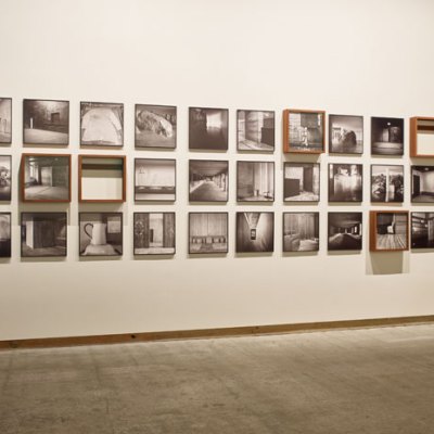
Crafting these descriptions requires writers of alt text to think about how their life experience colours what they see and share with the viewer. Some museums are putting serious thought into how to address this. Under the guidance of accessibility professional Lorena Bradford and blind and low-vision patrons, the NGA employs contractors and volunteers to write short descriptions of art in its collection. The museum has made hundreds of short descriptions available on its website, ranging in length from 100–300 words; these appear alongside artist name, materials, creation date and other categorical information.

Bradford has come up with explicit guidelines for the writing process – for example, advising writers to refer to certain people appearing in a painting, photograph or sculpture as a ‘person’ or ‘people’ to avoid assigning gender. Doing so requires writers to describe what about the person’s appearance or actions might suggest a certain gender without resting on assumptions. Similarly, writers are advised to describe skin colour and not race, and to do so for every person, rejecting whiteness as the default and forbidding the use of food-related words, for instance, to describe brown skin. It is these sorts of assumptions and habits that have made discussions of gender, race and colonialism in art so unsatisfactory over the years – something that many arts institutions are now attempting to address in earnest.
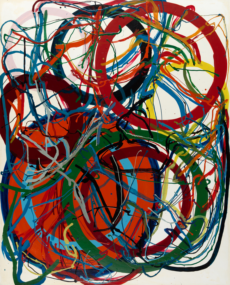
Descriptions should alert the viewer to all the emotions that the art elicits – including confusion, if appropriate. (This is often the case for abstract works, as in the Art Institute of Chicago’s alt-text description of Tanaka Atsuko’s Untitled [1964]: ‘Abstract painting of several various-colored and overlapping rings and circles, looser brushstrokes drake across the circles like winding thread.’) As well as not allowing their interpretations to cloud the descriptions, writers should also not censor the art: nudity, vulgarity and violence should be mentioned explicitly. Sometimes art brings joy, sometimes anger and disgust; written descriptions should allow viewers to encounter the art on its own terms.
Every writer of alt text should strive for neutrality, but that’s easier said than done. Anyone identifying visual content and writing descriptions does so from their own limited perspective. Being cognisant of certain privileges and prejudices can help alt-text writers avoid perpetuating certain kinds of structural harm, but it’s important to note that, as with sign-language interpretation, there is an art to translating what we see and hear. Just as curators and docents are critical members of museum teams, so too are accessibility service providers. Not only do they facilitate many people’s experience of art, but their work also invites patrons and accessibility professionals to imagine how alt text and audio description might best be applied outside of arts institutions.
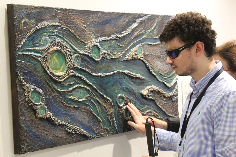
There are plenty of ways to get inspired, given the many approaches that museums are taking to improve accessibility for low-vision visitors. Some museums, including the Art Institute of Chicago and the Met, have provided tactile alternatives to artworks, creating 3D replicas or – as the Dorothy and Charles Mosesian Center for the Arts in Watertown, Massachusetts, did in 2019 – offering touchable original artworks for people to feel. Some museums have turned to AI to create audio description. The Rijksmuseum has partnered with Microsoft’s Copilot to create detailed descriptions of the million or so objects in its collection. At the Smithsonian, patrons can use an app called Aira to speak to an agent who describes the visitor’s surroundings.
These museums and others would do well to consider how to identify race and gender, embrace ambiguity and not censor adult content in their alt text and audio description offerings. Public arts institutions ought to be at the cutting edge of accessibility services, and the stronger they are at providing them, the more the wider field stands to benefit.
Emma Cieslik is a disabled museum worker, audio description professional and writer based in the Washington, D.C. area.