![]()
‘Four things to see’ is sponsored by Bloomberg Connects, a free arts and culture platform that provides access to museums, galleries and cultural spaces around the world on demand. Explore now.
Each week we bring you four of the most interesting objects from the world’s museums, galleries and art institutions, hand-picked to mark significant moments in the calendar.
Eighty-five years ago this week, Paul Klee – painter, musician and one of the most influential art theorists of the 20th century – died, leaving behind not only extraordinary artworks but transformative ideas about colour. At the Bauhaus, where he taught from 1921–31, Klee developed theories that imbued scientific colour systems with emotional and spiritual dimensions. Unlike many of his predecessors, who approached colour theory in a more mechanistic fashion, Klee’s work revealed colour to be a particularly charged property, able to suggest weight, temperature and movement. His notebooks record meticulous explorations of complementary contrasts, colour gradations and paintings in which hues interact like musical notes in harmony.
Klee’s insights into colour emerged from his close study of artists such as Cézanne, whose watercolours demonstrated how multiple translucent colour patches could create vibrating, prismatic effects. In turn, Klee’s teachings reverberated through generations of artists – from his students Josef and Anni Albers, who took his theories to America after fleeing Nazi Germany, to figures such as Gerhard Richter, who was inspired by Klee’s grids to bring emotional resonance to systematic arrangement. This week we explore four works that demonstrate the evolution of colour theory.
The Way to the Citadel (1937), Paul Klee. The Phillips Collection, Washington, D.C. © 2022 Artists Rights Society (ARS), New York, NY
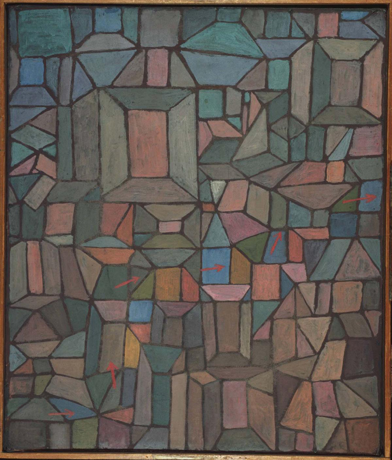
The Way to the Citadel (1937), Paul Klee
The Phillips Collection, Washington, D.C.
Blocks of colour – rich reds, deep blues and careful placements of yellow – accompany a path that winds upward through a kind of two-dimensional architecture. Rendered on burlap with layered oil paint, the composition exemplifies Klee’s mature colour theory: adjacent hues enrich each other while harmonising across the whole canvas. The gridded structure recalls his musical training, with each coloured square functioning like a note in a chord progression. Click here to find out more on Bloomberg Connects.
Forest Path (c. 1904–06), Paul Cézanne. On loan to Princeton University from the Henry and Rose Pearlman Foundation since 1976
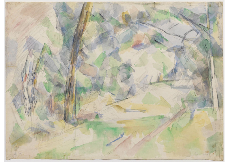
Forest Path (c. 1904–06), Paul Cézanne
Princeton University, New Jersey
Translucent patches of watercolour overlap and intersect, creating a dazzling mosaic of green, blue and violet veils. Cézanne builds a three-dimensional space seemingly through colour alone; warmer tones advance while cooler ones recede, without conventional perspective lines. This technique profoundly influenced Klee’s understanding of how colour could simultaneously construct and dissolve form. Click here to discover more.
Intersecting (1962), Anni Albers. Josef Albers Museum Quadrat Bottrop
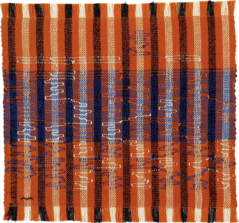
Intersecting (1962), Anni Albers
Joseph Albers Museum Quadrat Bottrop
Geometric bands in red, blue, white and black interlace in this vivid cotton and rayon weaving. A student of Klee at the Bauhaus, Albers translated his colour theories into textiles, exploring how overlapping threads can create dynamic colour relationships and optical effects. This work demonstrates her understanding of the ways in which colours can intensify or subdue one another at intersecting points, and her application of modern colour theory to the ancient craft of weaving. Click here to read more.
256 Colors (1974/84), Gerhard Richter. SFMOMA, San Francisco. © Gerhard Richter.
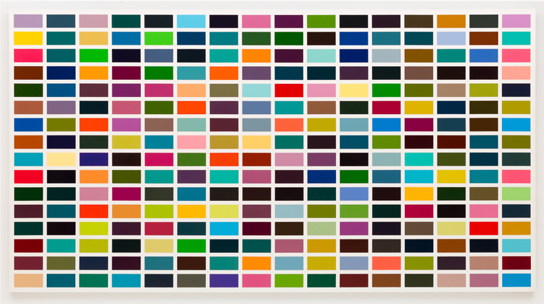
256 Colours (1974/84), Gerhard Richter
SFMOMA, San Francisco
A monumental grid of precisely painted colour squares presents a systematic yet psychologically charged exploration of the relationships between hues. Unlike the chance-based approach of Richter’s earlier work, this methodical arrangement reveals his deep engagement with Klee’s colour theories. The painting creates dynamic visual rhythms as complementary colours activate one another, using analytical precision to provoke peculiar sensations in the viewer. Click here to find out more.
![]() ‘Four things to see’ is sponsored by Bloomberg Connects, a free arts and culture platform that provides access to museums, galleries and cultural spaces around the world on demand. Explore now.
‘Four things to see’ is sponsored by Bloomberg Connects, a free arts and culture platform that provides access to museums, galleries and cultural spaces around the world on demand. Explore now.