A round-up of the week’s reviews
Nude on Sand – Oceano, California (1936), Edward Weston. The Royal Photographic Society Collection, National Media Museum, Bradford © Edward Weston

‘Drawn by Light: The Royal Photographic Society Collection’ (Peter Yeung)
The Royal Photographic Society’s collection is by photographers, from photographers, and for photographers. That much is evident from the number of masterly pictures on show, even if there were a quarter of a million to choose from. Francis James Mortimer’s Spirit of the Storm(1911) conjures up the shimmering, late work of J.M.W. Turner; Margaret Bourke-White’s capture of Coney Island captivates; and Ansel Adams’ Moonrise in New Mexico (1941) beatifically bewilders. Perhaps the only problem with ‘Drawn by Light’ is that each of these images warrants more context to explain them, and more space to breathe.
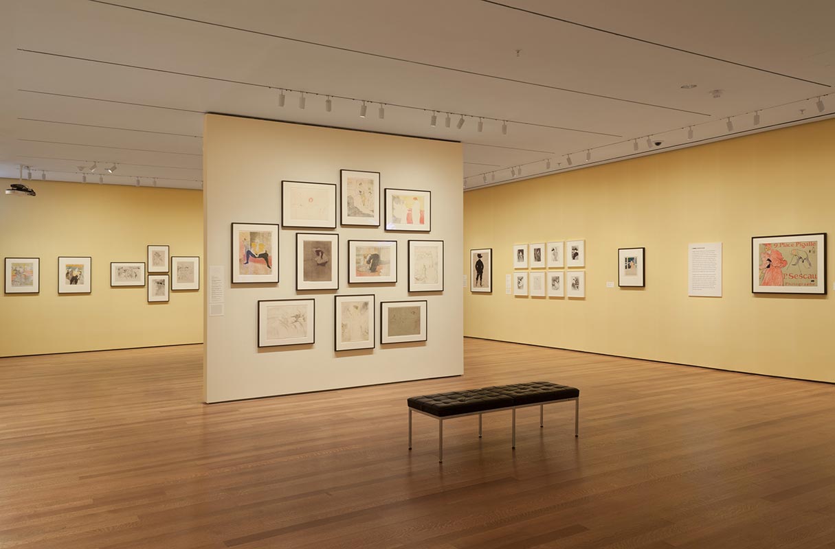
Installation view of ‘The Paris of Toulouse-Lautrec: Prints and Posters’ at The Museum of Modern Art, New York (26 July, 2014–22 March 2015). Photo by John Wronn © 2014 The Museum of Modern Art

‘The Paris of Toulouse-Lautrec at New York’s MoMA’ (Raisa Rexer)
The show does an excellent job of incorporating materials in a variety of media (including photographs, film, and digitised books) to situate Lautrec’s own multi-media production, which included everything from playbills to paintings but predominantly posters and lithographs, in his historical milieu. There is no better artist than Toulouse-Lautrec to bring both sides of the Parisian Belle Époque – the dark and the luminous, the decayed and exuberant – to life a century later, and he certainly does so here.
Photograph of rehearsals of ‘The Bolt’ (1931) Courtesy GRAD and St Petersburg Museum of Theatre and Music

Bringing back ‘The Bolt’: designs for Shostakovich’s ballet on show at GRAD’ (Jonathan McAloon)
The Bolt never really lived, so there is pathos to all the objects brought together here. But ‘Bolt’ is often inscrutable as well as exquisite. The black and white photographs of dancers in rehearsal are static representations of movement, reminders that you’ll never know where they were going. Only a handful of people ever did. There are two pages from a reduced piano score, annotated in pencil with small drawings of the stage, hinting at a snippet of the original choreography, all of which has been lost. Unfortunately for the modern gallery-goer, no transcription or translation of the Russian handwriting has been made available.
Scratching on things I could disavow: Preface to the fourth edition (2013), Walid Raad. Video. Courtesy the artist and Sfeir-Semler Gallery, Beirut / Hamburg

‘Postface’ by Walid Raad at Sfeir-Semler Gallery (Kasia Maciejowska)
The divided layout of Sfeir-Semler, with a ground-floor gallery followed by another space upstairs across the courtyard, perfectly suits showing two distinct sets of work, and the contrasting visual styles of Raad’s two projects are sharply felt. But so too is the conceptual continuity between them, brought out especially by the artist’s walk-through, given on the opening night. Hearing Raad indicate through his tone of voice the factual inconsistencies and playful touches contained in his work, opened up the experience of the images, objects and videos on the walls. Without this it is easy to miss his humour and feel vaguely confused; no matter though, this is part of the point.


