In 1937, the typographer and printer Will Carter sent a copy of his recently published edition of The Song of Solomon to the American calligrapher Paul Standard. Or rather, he tried to send a copy. US Customs impounded the book for impropriety and it took several months – and several letters – before Standard got his hands on the edition. When he did, it became clear why he’d had to wait. Printed and published by Carter at his own Rampant Lions Press, The Song of Solomon features six linocut illustrations by Cambridge-based artist Harry Hicken. Opposite the opening of chapter one, a full page is dedicated to the thick black outlines of a man and woman, their lips pressed against each other. She tips her head back and arches her spine, parts her legs and grips the sheets; he kneels, straddling her right thigh, pressing his fingertips into her hip. They are both nude.
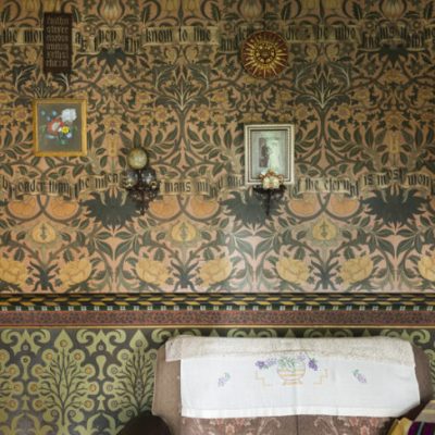
This is not the page to which The Song of Solomon is turned in the exhibition of Rampant Lions Press books at David Parr House in Cambridge. Instead, viewers are treated to the opening of chapter six and an illustration of a solo woman, supine, wearing nothing but a grapevine bracelet, gazing away from us and into the linocut’s cloudy sky. ‘Who is she that looketh forth as the morning, fair as the moon, clear as the sun, and terrible as an army with banners?’ The biblical poem is set in Goudy Text, a blackletter typeface designed by the American type designer Frederic Goudy in 1928. Blackletter forms, sometimes referred to as ‘Gothic’, are based on medieval script. For his typeface, however, Goudy took inspiration not from letters that some bygone monk had painstakingly inscribed on a sheet of vellum, but from the typeface used by Gutenberg in his 1455 bible. It is fitting to see these mock medieval letters here, in the beautifully restored house of David Parr, a craftsman-painter who decorated almost every surface in his home with neo-Gothic designs.
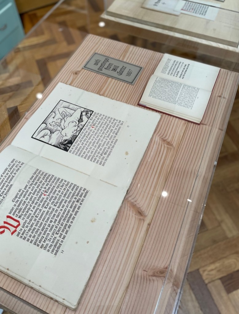
Display case showing pages from the Rampant Lions Press edition of The Song of Solomon, printed in 1937 and set in Goudy Text with linocut illustrations by Harry Hicken. © David Parr House
Rampant Lions Press is a little-known publisher and the books themselves – exemplary examples of both letterpress printing and the art of graphic design – deserve more attention. Like the Gutenberg bible, the Rampant Lions edition of The Song of Solomon features hand-rubricated initials and pilcrows. But Hicken’s illustrations mark it out as unmistakably of its own time. We see this juxtaposition of an old-fashioned typographic aesthetic with modernist artwork again in the pages of A Printer’s Dozen (1993), a volume containing spreads from 11 ‘unrealised books’ designed by Carter’s son Sebastian. In the case, the book is open to a spread showing text from Aesop’s fable ‘The Frogs Who Desired a King’. The frogs – some shown sitting, some disappearing into blue rule below so that nothing is visible but a pair of legs sticking straight up into the air – are made from geometric type ornaments. The effect is almost Bauhausian, frogs merely suggested by brown and green lines and circles. Hovering over the blackletter fable, they look even more modern simply by comparison.
The ‘Correction to William Morris’ printed by Sebastian Carter in 1995 for Gruffyground Press, set in the typeface Troy. © David Parr House
Combining the avant-garde with the antiquated was an inherent part of the early 20th century’s private press movement. Even by the time Will Carter was born in 1912, setting metal type by hand was already an archaic practice. Hot metal typesetting, whereby molten metal was injected into a mould, was invented at the end of the 19th century and allowed typesetters to operate a keyboard instead of fiddling about with individual metal letters. By the turn of the century, most large-scale professional printers – though not smaller presses such as William Morris’s Kelmscott Press – were using hot metal.
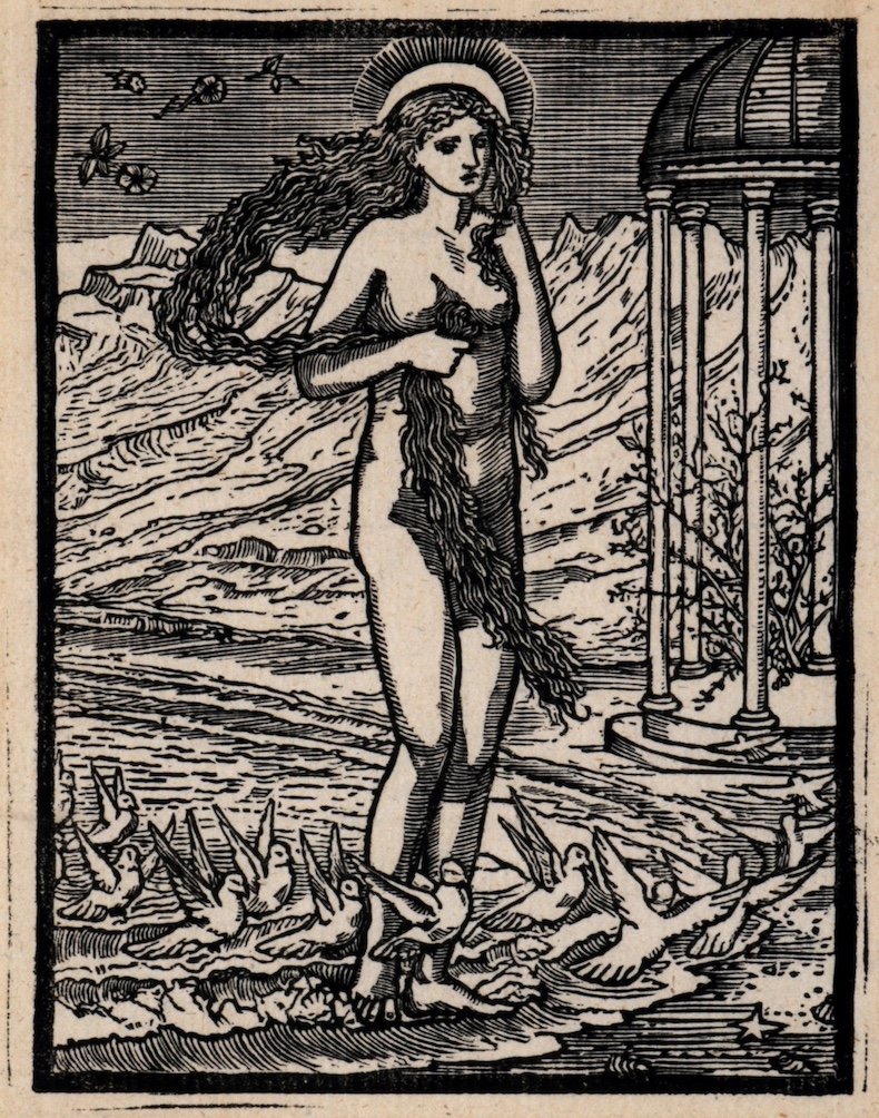
Morris’s influence on Rampant Lions Press is clear. In 1974, the Carters printed Morris’s poem The Story of Cupid and Psyche, which included wood engravings cut by Edward Burne-Jones. For this project, the father and son duo used Kelmscott Troy, a round blackletter typeface designed by Morris. Burne-Jones’s illustrations are Pre-Raphaelite in style, all flowing locks and elaborately draped garments, but the Carters’ page design, with its large margins and ample line spacing, gives the book a mid-century feel. Placed next to a page from Kelmscott’s own 1893 edition of Caxton’s The History of Godefrey of Bouloyne and of the Conquest of Iherusalem (1481), in which the type is closely set, the initial intricately illuminated and the margins overgrown with twisting vines, Cupid and Psyche seems stark and airy.
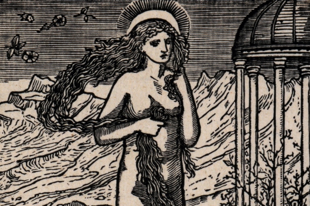
Venus on the Margin of the Sea, a wood engraving made by Edward Burne-Jones in c. 1866–68. The same block was used to illustrate a page of the Rampant Lions Press edition of The Story of Cupid and Psyche (1974). © William Morris Gallery, London Borough of Waltham Forest
Will Carter’s archaic love of blackletter was inspired by the German typographer Rudolf Koch, whose most famous designs include Kabel (the Monopoly font) and Neuland (used in the logo of American Spirit cigarettes and the stage musical The Lion King). Neither of these are blackletter, but then nor is Klang, the typeface Carter designed in 1955. You can see the influence of that toiling monk in these letters – the round of the lowercase g looks as though it has been produced by a carefully folded ribbon or a flat-nibbed pen – but the close verticals and diagonals of Gothic writing have been replaced by open curves and playful kicks. In a spread drawn by Carter to illustrate the evolution of Klang, we see exactly how he used bold loops and unexpected junctures to give the typeface its jaunty character.
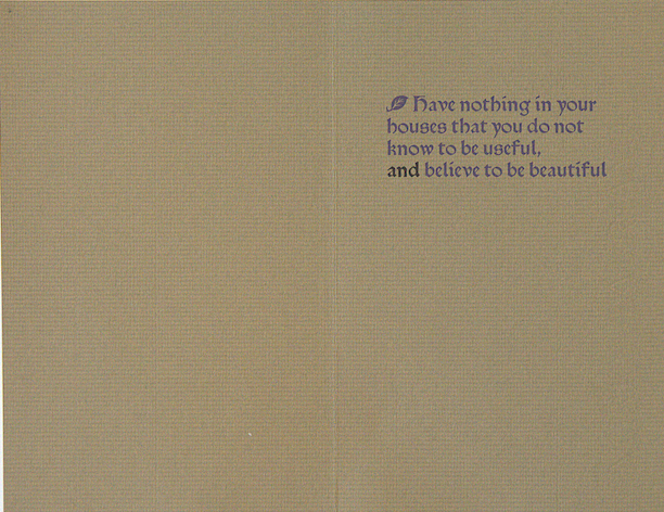
The Klang spread is one of several pieces of ephemera in the exhibition. There is also a ‘correction’ to Morris’s famous line about usefulness and beauty and a card extolling the virtues of letterpress printing. Mostly, though, the cases contain books. In a way, this makes sense: after all, that’s what the Carters were in the business of producing. It wasn’t until I was flicking through Sebastian Carter’s copy of his book The Rampant Lions Press: A Narrative Catalogue (2013) which was sitting on a sideboard that I saw a reproduction of The Song of Solomon’s risqué opening page. Books are intended to be experienced in four dimensions, pulled down from shelves and leafed through. Although it is a rare joy to see these books that were published in such small quantities, I was left with the overwhelming sense that something is lost when they are locked in vitrines, frozen in time like butterflies skewered with a pin.
Reproduction of a spread drawn by Will Carter to show the evolution of the Klang typeface, printed and published by Lund Humphries in 1957. © David Parr House

‘Goudy, Kelmscott Troy & Klang: The Rampant Lions Press in Response to David Parr’s Blackletter Work’ is at David Parr House, Cambridge, until 7 September.