From the October 2026 issue of Apollo.
In June 1961, Roy Lichtenstein painted a picture that was to be as revolutionary in the history of art as Monet’s Impression, soleil levant had been 90 years before.
Lichtenstein was then a 37-year-old junior professor at Douglass College, the women’s campus of Rutgers University in New Jersey. Like most other young American painters, he had been working as an Abstract Expressionist: ‘very late, 1961, and much of that was because it looked like art to me,’ he said. AbEx, more than a decade old, had begun to tire. Change was in the air, not least in the form of Allan Kaprow, a fellow teacher at Douglass who had staged his first Happening in 1959. Kaprow, Lichtenstein said, opened his eyes to the fact that ‘art didn’t need to look like art.’
It might, for example, look like comic books. Some time in that fateful month, Lichtenstein had flicked through one of these, Donald Duck: Lost and Found, the property of his young sons, Mitchell and David. His eye was caught by a particular image, of the hapless duck having hooked himself by the tail of his sailor suit while out fishing with his sniggering mouse friend.
After some preparatory sketches, Lichtenstein set to work repainting the image in oil on canvas. The result was to be the first in a line that would define him as an artist and help open the floodgates of American Pop Art: Look Mickey. Unlike Donald, Lichtenstein had genuinely hooked a big one.
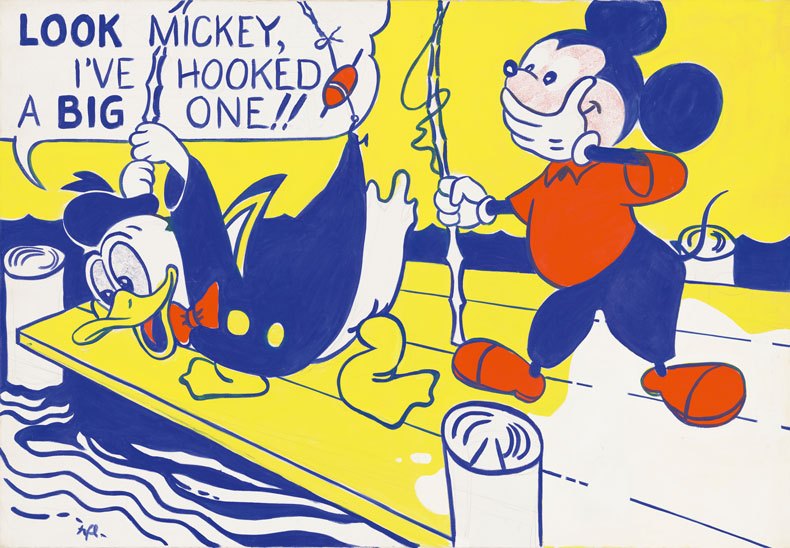
Though much remained the same in Lichtenstein’s appropriation, many things were different: materials, scale and context being the most obvious. There were also literal changes from the first cartoon. Where the triumphant cry of the picture’s title had appeared in this as a caption, Lichtenstein now turned it into a speech-bubble. He also altered the four-colour, CMYK palette of the old image to a smaller spectrum of primaries: red, yellow and blue, with patches of white.
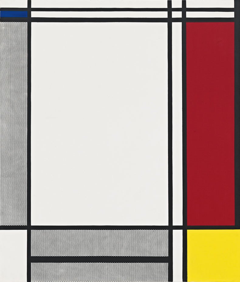
In this, he was doing two apparently antithetical things. On the one hand, three-colour printing was the remit of cheap, newspaper strip-cartoons, as were speech bubbles. Look Mickey was thus taking a low-end image further downmarket, the original having appeared in a relatively pricey comic book. But, by way of absolute contrast, working in primaries and black and white had also been the domain of one of Lichtenstein’s great heroes, the inventor of neoplasticism, Piet Mondrian. Nothing said ‘high art’ more clearly than Mondrian.
The plot thickens further. Like many avant-garde artists, the intensely cerebral Mondrian had been mesmerised by cartoons – notably Walt Disney’s Snow White, which he saw night after night at a local cinema when he arrived in Hampstead from Paris in 1938. Picasso, too, had been a comic-book fan. As Gertrude Stein recounts in The Autobiography of Alice B. Toklas, the man who gave the world Guernica had arrived at its style at least in part via her gifts to him of the American comic strip The Katzenjammer Kids. If African masks and Oceanian fetish figures had contributed the iconography to Picasso’s cubism, its simplification and flattening against the picture plane came, Stein claimed, from Hans and Fritz Katzenjammer.
All of which made Lichtenstein’s new work something of a mise en abîme. Critics have tended to assume that his aim in transferring the single panel of a comic book into paint on canvas had been to satirise the quasi-mystical leanings of Abstract Expressionism, a school that held painters as shamans, and to which he himself had until recently been in thrall. That is certainly true, but by no means the whole answer.
There was also a question of ontology. ‘I was always interested in, and always baffled by, why are these few marks art and these few marks not art,’ Lichtenstein said in 1996, the year before his death at the age of 73. It was a subject he had raised again and again in his career, in his misleadingly offhand way. Central to the mystique of Abstract Expressionism had been mark-making, the visible and subjective stroke of the painter’s brush. In Lichtenstein’s words, ‘It looked like art to me.’ But why?
It was a pressing question, in being a question at all. Post-war America sold itself as an imperium of certainty, not doubt. Key to that was a belief in the American way, to which the key in turn was capitalism.
There were tangible things, durable goods – cars, lorries, refrigerators, washing machines – the value of which was unquestionable. In The Hidden Persuaders (1957) the social critic Vance Packard had analysed the means by which American consumers were manipulated into believing their eyes. Lichtenstein, too, was intrigued by the fact that a way a thing looked could make it true. His own embracing of Abstract Expressionism was founded on its resemblance to art. He was not immune.
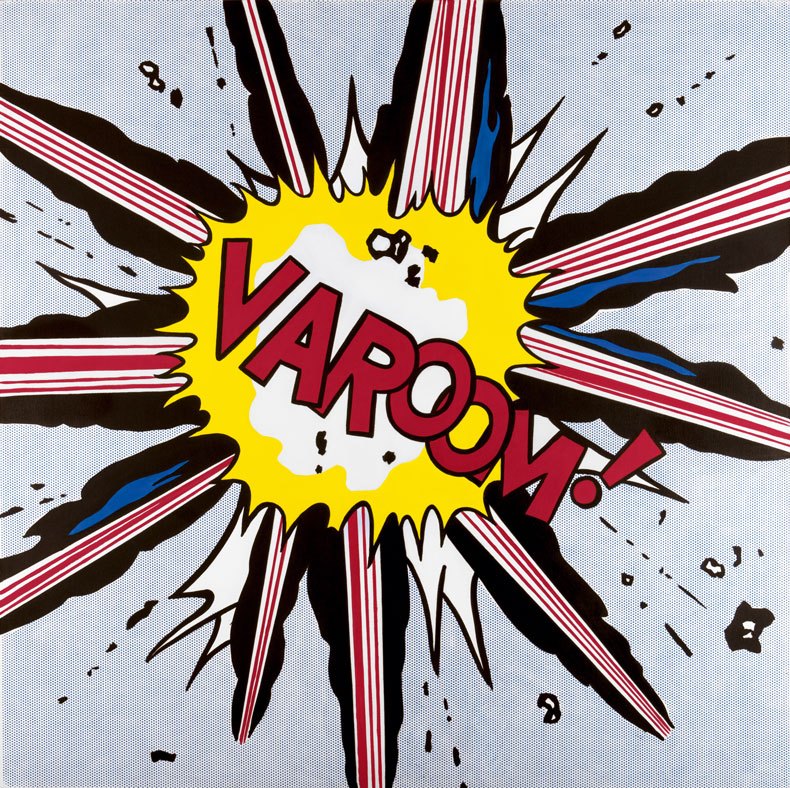
And so he hit on a schema that was as old as Georges Seurat. In the mid 1880s Seurat had, famously, invented pointillism. His peinture au point, too, responded to a new way of seeing brought about by the spread of chromotypographic printing in mid 19th-century France. Why, Seurat wondered, should a pattern of lines etched on a zinc plate and printed on paper be taken for reality, and by so many people?
The crowd Seurat depicted in A Sunday on La Grande Jatte (1884–86) was made up of precisely the kind of averagely sensual men and women who most consumed these new, popular images. And so Seurat invented a method of representing these people that both echoed chromotypography and suggested a problematic. Where painters had habitually worked in brushstrokes, he would paint in dabs or dots. Seen from a distance, those of the surface of La Grande Jatte both resolve into legibility and glimmer delightfully. And yet the people depicted on that surface are curiously wooden, robotic; going about their unquestioning way like so many smartly dressed trams.
There was, in all this, the whiff of politics. Seurat, like his friend and fellow Post-Impressionist Paul Signac, was an anarchist. The idea that all their dots might work together while each retaining an individual significance tallied satisfyingly with anarchist thought. For Lichtenstein, too, dots would be political.
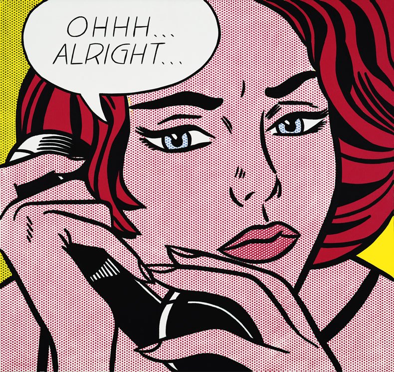
They make their first appearance in Mickey’s flushed cheeks. In the late 19th century an illustrator called Benjamin Day had invented a method of printing using spots of pigment of varied sizes and spacing to create shades and colours. Known, after their creator, as Ben-Day dots, these were ubiquitous in American illustrated publishing. They would also be the bedrock of Lichtenstein’s new work.
In Look Mickey, their use is largely restricted to the eponymous mouse’s face. This sets up a tension between the dotted area and the rest of the picture, which is rendered in flat, unbroken colour. The split is autobiographical: Mickey’s face is the new Roy Lichtenstein, the rest of the image the old. Here, paint has been applied traditionally with the stroke rather than the dab of the brush. The brush stroke, the artist’s mark, was fetishised by Abstract Expressionism as evidence of the maker’s subjective genius. Lichtenstein was to have no more of it.
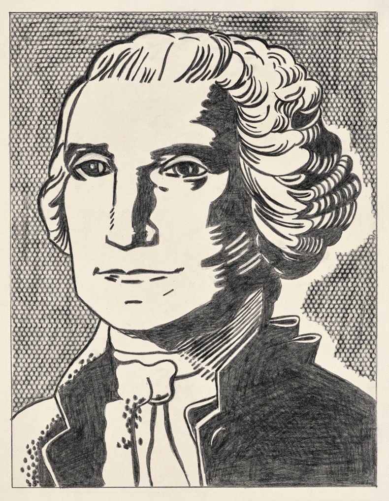
In Look Mickey the Ben-Day dots are painted freehand; which is to say, they are not Ben-Day dots at all, but portraits of them, handmade marks trying to look mechanically made. This back-and-forth between man and machine was part of a current in art at the time, typified by works such as the painstakingly graphic paintings of Agnes Martin, which looked as though they might have been made mechanically but were insistently not. By George Washington (1962) Lichtenstein had hit on the technique that would see him through the 1960s, using factory-cut metal stencils through which he would brush paint to produce dots that were more genuinely mechanistic. His Washington is the reproduction of a reproduction, a print of the famous portrait of the first president by Gilbert Stuart: the same that appeared on the most American of things, the US dollar bill.
This erasure seems aimed squarely at parodying the artist-as-genius tenets of Abstract Expressionism, interrogating the boundary between Low Art and High. And yet. When Lichtenstein painted Non-objective I in 1964, the last thing on his mind would have been to mock Mondrian, an artist who he held in the highest esteem. So what was his intention?
Part of the genius of his art is that there is no obvious answer to this question. Cartoons are simple things, literally legible. We can not hear the sound of Whaam! (1963), but we can read it. And yet Lichtenstein’s cartoons are also utterly illegible, poker-faced; affectless, in the way that La Grande Jatte is affectless. That we can read the sound of Whaam! only highlights the fact that we cannot hear it. The work is silent, unmoving in both senses of the word.
This paradox is central to Lichtenstein’s art. The Ben-Day dots are there to alert us to the fact that his images are reproductions, whether of Mondrian or Disney. But to reproduce is to do what? It might be to pastiche or parody, or it might be to render iconic: reproduction is, after all, the sincerest form of flattery. What makes his intention all the more enigmatic is Lichtenstein’s attitude to his own work.
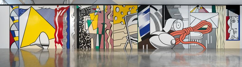
In 1983, 20 years after his first cartoon paintings, he made a mural for his New York gallery, Castelli. It was Castelli that had given him his break as a Pop artist, and Greene Street Mural was by way of being a retrospective – the summing up, in a single, 30-metre-long image, of everything that had happened in Lichtenstein’s art over the previous two decades.
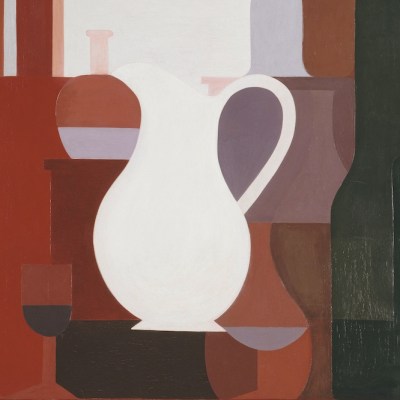
Iconographically, there were slices of Swiss cheese, office supplies, marbled notebooks – all things that had appeared in his work. There were also nods to classic moments in art history, from the Pyramids to Picasso. Also to Purism, the stylistic brainchild of Amédée Ozenfant.
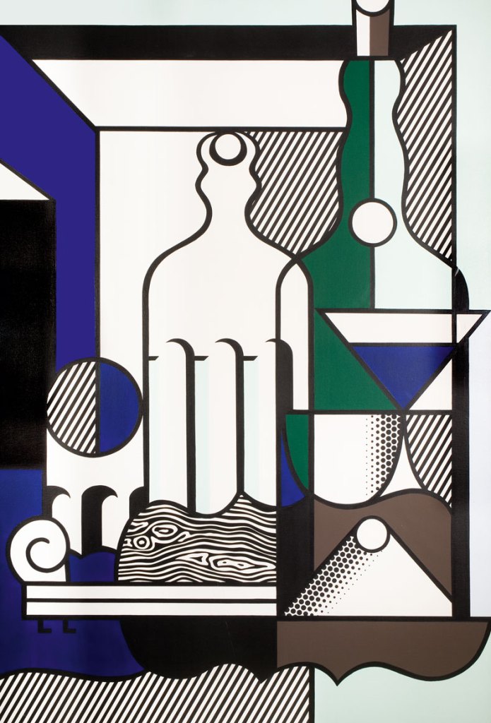
It has been suggested that Lichtenstein, fresh out of the army after the Second World War and with GI Bill dollars in his pocket, had gone to Ozenfant’s School of Fine Arts in New York. There is no evidence for this, the confusion having perhaps come about as a result of a series of soi-disant Purist paintings that Lichtenstein made in the mid 1970s; Wolverhampton Art Gallery’s Purist Painting with Bottles (1975) is one. What had obviously caught his eye was the cartoonishness of Purism, the way it reduced the world to a set of Platonic forms, flattened anti-illusionistically against the picture plane.
Greene Street Mural may have looked playful, in other words, but it also took itself and its maker very seriously. Part of that seriousness was its impermanence. Written into the contract for the mural’s commission had been a stipulation that it would only be shown for six weeks, after which it would be destroyed. It was. Lichtenstein’s magnum opus is thus known to us only in reproduction, either photographically or, as happened at Gagosian New York in 2015, as a recreation.
Whatever it was that Lichtenstein had done to the work of Mondrian, Picasso and Ozenfant, he now did to his own. In being themselves reproductions, his paintings set themselves up to be reproduced and, from the start, they were. Sturtevant’s Lichtenstein Girl with Hair Ribbon (1966–67) was made barely a year after Lichtenstein’s Girl with Hair Ribbon (1965; Museum of Contemporary Art, Tokyo), differing from it in being two centimetres smaller in each dimension. Lichtenstein’s response to all of this was characteristically sphinx-like.
Three years after the centenary of Lichtenstein’s birth, this month the Whitney Museum of American Art is staging a major retrospective of his work, the first in the artist’s native New York for 30 years. The show’s subtitle, ‘Like New’, is satisfyingly cryptic. Lichtenstein’s work was all about newness, but it was also about processes as old as art itself.
‘Roy Lichtenstein: Like New’ is at the Whitney Museum of American Art, New York, from 11 October–10 May 2027.
From the October 2026 issue of Apollo.