For centuries, ambitious architects have been dependent on sublime visualisers, from John Soane and Joseph Gandy to Norman Foster and Helmut Jacoby. In ‘Superstructures: The New Architecture 1960–1990’ at the Sainsbury Centre for Visual Arts, Norwich (closed 2 September), the most arresting exhibits – alongside the models – are the renderings, perspectives, exploded sections and elevations, from the elemental to the intense, drawn by architects and engineers, but also by their draughtsmen.
In the exhibition’s accompanying book, the ‘High Tech’ architecture developed by Foster, Richard Rogers and their peers in the late 1960s is described as ‘an ethos rather than a style’. But the buildings of the period come into their own when imagined in drawings. These range from the slight, such as the ideogram drawn by Mike Davies in 1982 for Richard Rogers’ Inmos microprocessor plant – little more than a tepee-like shelter for a hen and chicks – to dense and allusive images by Jacoby.
Norman Foster (b. 1935) is an instinctive draughtsman; in Birkin Haward (b. 1939), who joined his tiny office in October 1969, he spotted another prodigious architect-illustrator. As a student at the Architectural Association, Haward had spent his evenings drawing up schemes in architects’ offices. Patrick Hodgkinson’s Brunswick Centre, he says, proved a task difficult enough to earn ‘a stiff cocktail’ afterwards. Haward became an early partner in Foster Associates, leaving only in 1983 to set up in practice with his wife Joanna, as van Heyningen & Haward Architects.
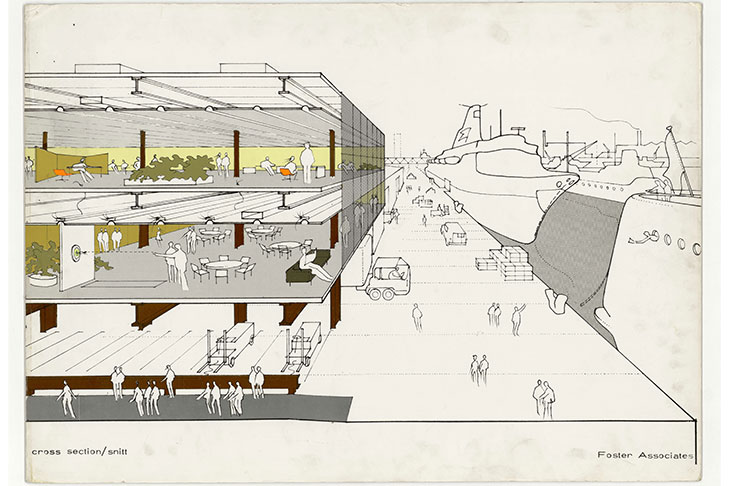
In 1969, Foster Associates secured its first big job, the Fred Olsen passenger terminal in Millwall Docks. The concept was developed through innumerable drawings on which Foster and Haward worked side by side, the most convincing images being taken to the client for further discussion. The next, larger office, in Fitzroy Street during the 1970s, was also awash with drawings for schemes built and unbuilt.
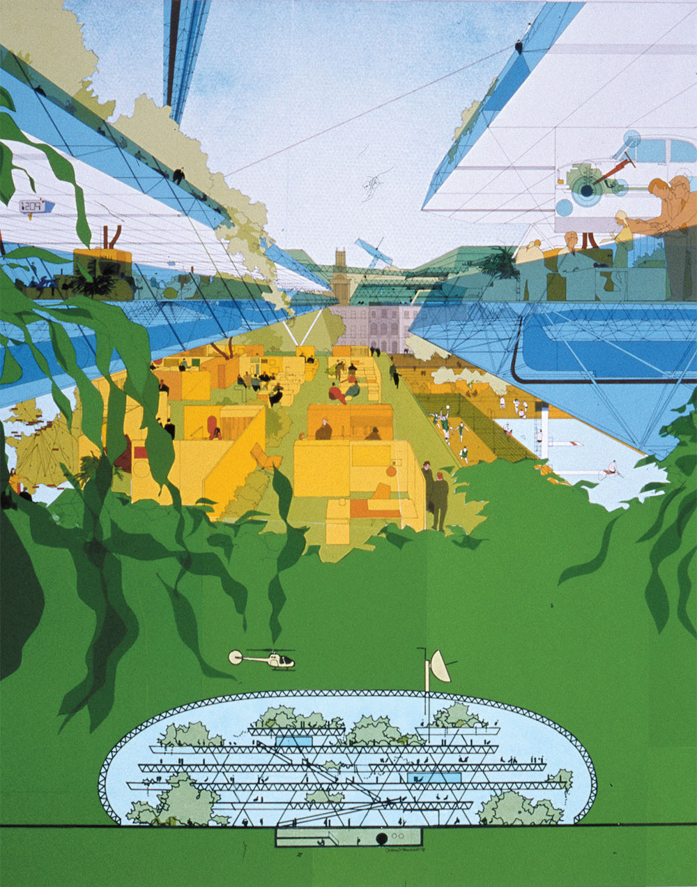
Drawing by Birkin Haward for the ‘Climatroffice’, an unbuilt project by Foster Associates in collaboration with Buckminster Fuller (c. 1971). Courtesy Birkin Haward

In his biography of Foster, Deyan Sudjic describes Haward as ‘responsible for some of the most memorable drawings coming out of the office at the time’, gently subverting them by ‘slipping in counter-cultural vignettes in the shape of hot-air balloons and hippies’. Haward enjoyed introducing cars, planes and fashionably dressed people (traced or collaged from magazines) and exploiting the novel possibilities of Letratone and Letracolour, which from the mid ’60s onwards supplied colour, grain, and other graphic effects. Architectural renderings took many forms in these years; the radical architectural collective Archigram had set the pace for the graphically unexpected. However mechanistic in appearance the sectional perspectives drawn by Jan Kaplický, another early Foster employee who was much influenced by aeronautical engineering-style cutaways, there was no CAD software, far less BIM available to disrupt anyone at their drawing board.
For all the technology now available, as Haward himself recently pointed out to me, Norman Foster still pitches to clients by showing them his own design drawings. They are the most immediate and descriptive way to illustrate his thoughts. This is exemplified in video footage from 2012 (available on YouTube), in which four world-class practices vie to gain the commission for an office tower in Manhattan at 425 Park Avenue. In a daylit room and in low-key, layman’s language, Foster explains the working drawings (for ‘your building’, as he puts it), which are handed over by an assistant. Foster + Partners would go on to gain the job; Foster’s presentations quite literally left his rivals – with their backlit PowerPoint presentations and computer-generated imagery – in the dark.
It was the eye and hand of another draughtsman, Helmut Jacoby (1926–2005), which helped to propel Foster Associates on to the international architectural stage. Born in Halle an der Saale, Germany, Jacoby had gone to the US in 1952 to study architecture at Harvard. Before long he changed direction to work as a renderer for architects such as Marcel Breuer, Eero Saarinen, I.M. Pei and Philip Johnson, whose protégé he was. In 1968, exhausted, he headed back to Germany, to Wiesbaden (he would return to Halle after reunification). Having failed to rekindle his architectural career there, he turned again to architectural illustration.
Drawing by Helmut Jacoby for The Plan for Milton Keynes (1970). © Homes England

Jacoby’s superb, complex images of the nascent new town, Milton Keynes, were created for the Milton Keynes Development Corporation (MKDC) and its master architect and planner, Derek Walker. The city centre that Jacoby conjured up in intense, monochrome detail, even incorporating subtle reflections, was based on nothing more than the master plan and the shared ambitions of key members of the team. Long before building began on site, in 1970, Jacoby had grasped all the essentials of the city that the designers envisaged. Milton Keynes city centre is arguably as much the creation of this well-liked, modest man as of anyone else.
Foster employed Jacoby to produce a series of dazzling, near-hallucinatory drawings, starting with perspectives of the Willis Faber & Dumas headquarters in 1971 (drawn well before the curvaceous, glass-walled insurance office was built in Ipswich) and ending with what would prove to be competition-winning drawings for the Reichstag in Berlin. For those, Jacoby turned to colour. He had been on hand for some 20 years to produce definitive images of Foster’s procession of svelte sheds, whether art galleries, airports or company headquarters, including the Sainsbury Centre (in 1973) and Stansted Airport (in 1985); the essentials of the HSBC headquarters in Hong Kong, completed in 1985, were already evident in Jacoby’s renderings of 1979.
Yet when drawing drives design, as it surely must, Foster is the acknowledged master. Haward recalls him producing an ‘astonishing’ series for the Willis Faber & Dumas building, done literally overnight. Jacoby is often compared to the American visionary Hugh Ferriss, who worked some decades earlier; Foster, tens of thousands of whose own drawings are housed (and digitised) in his new foundation in Madrid, could – a little cheekily perhaps? – be compared to Hawksmoor, at least for the vigour of his hand and the consonance between his pencil and his practice. Architectural drawing shows signs of being in rude health.
From the September 2018 issue of Apollo. Preview and subscribe here.


