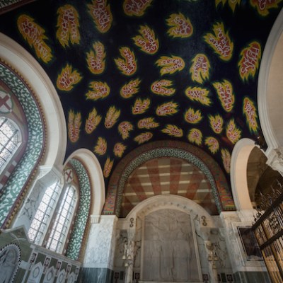
The triforium at Westminster Abbey has been transformed with the installation of new galleries. Stuart McKnight of MUMA, the architects responsible for the exhibition design, tells Thomas Marks about the experience of working at the Abbey
What does it mean for you, as architects, to have worked at Westminster Abbey?
There’s nowhere like the medieval triforium [where the Queen’s Diamond Jubilee Galleries are located, more than 16 metres above the nave], with its combination of a cranky structure of roof timbers, which means it feels attic-like, its decorative details that suggest these spaces were meant to be visited, and then the wonderful views across the buttresses to the Palace of Westminster and back into the Abbey itself. It’s such an inspiring and unique space to work within. I guess we’re aware that we’re never going to work within a space like it again, so we were delighted to have won the commission and to have had the experience.
The triforium wasn’t previously being used, other than for storage and as a vantage point for television cameras during important services. What challenges did it present when you first studied the brief for the new galleries?
The first time I visited, with my colleague Gillian McInnes, we were completely overwhelmed by the qualities of the space – by the light, the unfolding views, and the artefacts that were already stored up there. It had an otherworldly quality, which is hard to describe. In the lapidarium that was up there, for example, we found the maquettes of the statues of the modern martyrs from the Great West Door just standing there, looking out the window in their own quiet contemplation of the view out to the Palace of Westminster. I think the challenge for us was to try to not change it – to make a museum without undermining the space.
We saw fabulous sunbeams shafting through the space, and areas of deep shadow, and we understood from some of the data that we were given at competition stage how this strong sunlight would move around and vary throughout the year. The principal challenge that the space set us, or that we set ourselves, was to find a way to display incredibly light-sensitive artefacts up there without removing the sunbeams, and without changing the quality of the space. Then of course there were practicalities, particularly in thinking about the scale of the artefacts: how do you deliver a sarcophagus up into an attic space?
Maquettes for the modern martyrs above the Great West Door of Westminster Abbey, displayed in the Queen’s Diamond Jubilee Galleries. Photo: Alan Williams; courtesy Westminster Abbey

What lessons did you draw from other museum displays you had designed, such as the Medieval & Renaissance Galleries at the V&A?
We probably came to the Abbey’s attention because those galleries have so many medieval artefacts that were similar to some in its collection. At the V&A, we set ourselves a comparable challenge in terms of light: we’re dismayed by black-box galleries that lead to museum fatigue for visitors. An interest in light and views influences much of our work. For our project at the Whitworth Art Gallery in Manchester, we opened up views to the gardens and the park, glimpses of greenery from the gallery spaces.
At the V&A, we started to push towards lighter galleries, working with engineers from Arup to model patterns of light that would allow us to position individual displays in places of darkness, and ensure that we didn’t need to darken the whole room to suit a single object. For the triforium, we worked with the lighting designer Max Fordham, using similar methods. It’s really about trying to think about the space, and how visitors will experience it, and then designing the exhibition to suit the inherent characteristics of the space, rather than changing the whole room to suit the artefacts.
How did you take into account the significance of Westminster Abbey
as a functioning religious building?
In terms of displaying artefacts, we’ve tried to help visitors understand what they are and how they would have been used. The two altarpieces [the Westminster Retable, dating to the 13th century, and a 15th-century altarpiece from Florence by Lorenzo di Bicci] are as close as possible to facing west, the orientation that they would have had in a church, and they’re displayed at a height which recalls that setting. Altar plate is shown on a plinth, like an altar, rather than being stacked on shelves as it would be in a traditional museum case. The processional copes are set up to follow each other in a line, suggesting the beginning of a procession. We included these hints where we could.
A very special achievement of this project, I think, is that it was built while services in the Abbey were going on down below. There was a process of stoppages that the contractors had to juggle, so that the construction stopped for every service, throughout the whole duration of the construction of both the galleries and the new Weston Tower [designed by Ptolemy Dean, the Abbey’s Surveyor of the Fabric], which provides access to the triforium.
How did you work with the Abbey and its curator, Susan Jenkins, in devising the display?
The four sections of the brief [‘Building Westminster Abbey’, ‘Worship and Daily Life’, ‘Westminster Abbey and the Monarchy’ and ‘The Abbey and National Memory’] were determined before we were appointed, so they already had a clear, established structure for the exhibition. There were artefact lists, not quite complete, but with the key objects identified – so we were able to take those and start to use them to structure the space. Our approach to the exhibition was not to specify any predetermined route for the visitor, but to allow them to explore and be drawn by sightlines to objects positioned in key locations. The curatorial team were really supportive of that.
Effigy of Lord Nelson (1806), Catherine Andras. Courtesy Westminster Abbey, London

There was also a cyclical process of working with the curators. We encouraged them to create a ‘status A’ list, of objects we had to display, and then a ‘status B’ list of artefacts they wished to display if there was enough space. Through discussions of the importance of the objects, their scale, their condition, and their visual impact, we started to narrow them down – fitting smaller or less important objects into the overall structure, but always trying to look for curatorial connections between pieces. And then we threw the challenge of sunbeams and shadows into the mix…
Did particular objects, or groups of objects, present unusual challenges in terms of display?
So many artefacts have their unique characteristics, which we picked up as we worked with them. With the earlier royal funeral effigies, carved in wood, conservators need to be able to inspect them very carefully. So we designed a new approach to opening showcases, working with a case manufacturer, which lets the whole interior of each case slide out like a big long drawer, cantilevered because the floor is uneven and sloping; an incredible piece of engineering by the case manufacturers Glasbau Hahn, as the cases have no frames. Throughout, we tried to minimise the number of materials we were using to keep our intervention in the space as calm and discreet as possible.
How did you approach the later effigies – which are standing waxworks – including those of figures such as William Pitt and Admiral Nelson?
We tried to contextualise them. So in the section on monarchy, before you find the wax effigies, you first encounter the evocative wooden effigies. These had previously been displayed standing up, like tailors’ dummies, but we’ve displayed them reclining, as they would have been experienced by Londoners watching a funerary procession, lying on top of the coffin and paraded through the streets. There’s an audiovisual display to explain what they are, and we draw the visitor’s focus to the incredibly lifelike head of Henry VII [possibly made by Pietro Torrigiano]. Then you turn a corner, and find the wonderfully flamboyant effigy of Charles II; the wax figure is quite unexpected, but appropriate when displayed in context and in a dignified way.
Funeral effigy head of Henry VII (1509), attrib. to Pietro Torrigiano. Courtesy Westminster Abbey, London

The effigies that aren’t related to the monarchy are introduced through a section explaining the role of the Abbey for the nation. The first things you encounter are visitors’ guidebooks, to understand the history of the building as a destination for visitors. There’s no doubt that the Abbey historically had effigies of public figures to appeal to visitors: Nelson is buried in St Paul’s, but the Abbey needed a figure of him, too.
John Betjeman called the view from the triforium ‘the best in Europe’. How does it complement the new galleries?
It’s a very special view, and every time I’m there I pause and look at it. Our way of handling it has been quite simple: we’ve left a lot of space to allow people to gather there, to encourage them to pause and not feel overwhelmed by museum objects. And that’s related to the way we worked with the Abbey throughout. The building was the most important artefact that we had to display.
To find out more about the Queen’s Diamond Jubilee Galleries, visit Westminster Abbey’s website.
From the July/August issue of Apollo. Preview and subscribe here.


