From the May 2026 issue of Apollo.
Recalling Whistler at work on his infamous Peacock Room, the painter Mortimer Menpes wrote: ‘Whistler, together with a pupil who acted as assistant, set to work with great pails of Antwerp blue, and books upon books of gold leaf […] At moments they worked so frantically that it seemed to be raining gold. Their hair became gilded; gold settled on their faces and on their lungs; they choked, and sneezed, and could scarcely breathe.’ Created for Liverpool shipping magnate Frederick Leyland between 1876 and 1877, the Peacock Room began as a commission to lightly adjust the colour scheme of the London dining room that architect Thomas Jeckyll had designed to display Leyland’s ceramic collection. When Leyland left London for an extended period on business, however, Whistler began to transform the room into a sparkling fantasia, prompting a vicious feud with his former patron and friend. The room remains Whistler’s most famous use of metallic pigments. Dazzling viewers, its hues of gold and teal evoke fluttering iridescent feathers, an effect that would have been even more striking under flickering gas lamps. Spectacular as it is, the Peacock Room was by no means Whistler’s sole experiment with metallic surfaces and Tate Britain’s monumental retrospective this summer will offer ample opportunity to appreciate this glittering thread that runs through his work.
Whistler’s interest in metallic surfaces first emerges in Caprice in Purple and Gold: The Golden Screen (1864), which depicts the red-headed model Joanna Hiffernan seated in front of a gold-ground Japanese screen as she examines prints by Utagawa Hiroshige. The scene recalls the stagey, self-aware orientalism of Whistler’s studio as depicted, for instance, in The Artist in His Studio (1865–66), where he stands jauntily among two off-duty models and the collection of Asian art he used as studio props. The interior is sparse, but its fashionable display of blue-and-white Chinese ceramics already anticipates the Peacock Room. Nearby, the gilded mirror that glints as it emerges thought-bubble-like from behind Whistler’s head could easily be mistaken for one of his later nocturnes, streaked with shadow and edged in gold. The Artist in His Studio wavers between his conflicting impulses to depict a modern scene and a Japonesque one, but this wavering is Whistler’s true subject, and at the heart of his experiments with Japanese styles. Painted in broad strokes of muted ochre, the titular golden screen of Caprice in Purple and Gold fills the canvas’s upper half, its tone shifting across the folded panels to suggest light and shadow across a gilded surface. Almost certainly based on a real object painted in the yamato-e style, the screen depicts sumptuously dressed figures within an interior glimpsed from above between swells of gold clouds. Whistler draws from the screen compositionally, disturbing European conventions of perspective by tilting the floor upwards and mimicking the screen’s palette of saturated colour and shimmering gold.

The painting’s dramatic colour effects are completed by its wide, gilded frame. Inspired by the English Pre-Raphaelites, Whistler began designing frames in 1864 and understood them as essential to his compositions. He once claimed, ‘my frames I have designed as carefully as my pictures – and thus they form as important a part as any of the rest of the work – carrying on the particular harmony throughout.’ The frame surrounding Caprice in Purple and Gold shimmers with incised patterns drawn from books like Owen Jones’s Grammar of Ornament (1856) and from Whistler’s own collections. A lattice-like pattern wraps around its outer edge while a field of tiny whorls covers its inner frieze, with round Japanese crests or mon (possibly drawn from textiles) embellishing the corners.
Victorian accounts of Japanese art lingered over the textures and patterns of gold screens and lacquers, with one account from the 1880s even declaring, ‘In the production of gradations of effect in gold the Japanese stand alone.’ Whistler and his fellow aesthetes admired gilded objects from Japan not only for their beauty, but also because they simplistically understood them as pre-industrial objects crafted at a distance from the vulgarity of European commerce. Ironically, however, it was this alleged distance which made them into popular (and profitable) commodities. Whistler’s efforts to imitate Japanese objects are steeped in his anxieties about selling his artwork while disdaining commerce. Harmonising with and emphasising the gold screen depicted on the canvas, the gold frame surrounding Caprice in Purple and Gold presents the painting as both a window into a Japonesque interior and the kind of lustrous object found in such spaces.

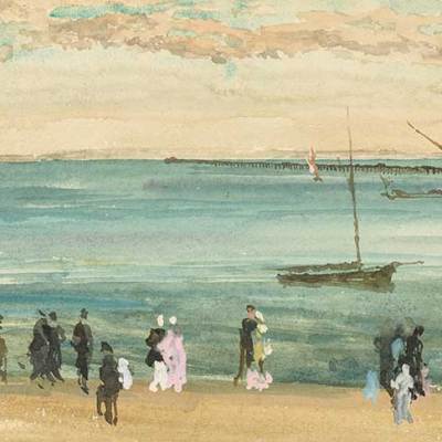
Of the original gilded frames that will appear in the Tate’s exhibition, that surrounding Nocturne: Blue and Gold – Old Battersea Bridge (c. 1872–75) highlights how Whistler’s metallic surfaces fit within his larger concerns with sheen and reflection. Whistler was obsessed with depicting the play of light across reflective surfaces, whether a firework reflected on water or a face reflected in a mirror. His titles, which frequently refer to gold and silver, reverently draw attention to subtle glimmers of light and colour, insisting on their value and preciousness. As Joyce Townsend and Jane McCree discuss in the exhibition’s catalogue, he also meticulously controlled his paintings’ surfaces on a material level, for instance mixing resin into the ‘sauce’ of paint used to create his nocturnes so that his thin paint layers would not turn matte. Whistler’s experiments with metallic surfaces are a part of his larger fixation with the ways that paintings depict, reflect and absorb light, and his gilded frames cleverly reinforce the light effects depicted on his canvases. In the frame surrounding Nocturne: Blue and Gold – Old Battersea Bridge, for instance, the bright gold peeking out between blue semi-circles (painted in a Japanese wave or seigaiha motif) echoes the river’s light-struck ripples. The frame’s raised and burnished gold reeds likewise catch light to echo the trail of the falling firework and the glitter-paths of distant lights across the water. As Whistler explained when the painting was brought into the courtroom during his libel trial against the critic John Ruskin, ‘The frame and the picture together are a work of art.’
Whistler’s first work to include metallics in its central composition, not solely its frame, was Blue and Silver: Screen, with Old Battersea Bridge, a folding screen likely begun in 1871. The screen’s format echoes Japanese folding screens and, as Ayako Ono discusses in the exhibition’s catalogue, Whistler even affixes bird and flower paintings by the painter Ōzawa Nampo to the screen’s reverse. The front of the screen, like the nocturne discussed above, depicts a view of London’s Battersea Bridge, here shown as if seen from a boat. The screen is the artist’s only known painting in distemper, but its thin washes of colour, so suggestive of currents and fog, link it to his oil paintings. Though the title refers to silver, he rendered the moon in gold paint, weathering the surface to suggest worn gold leaf or even cratered lunar topography. On the screen’s left-hand side, he used a piece of bright, solid gold leaf to depict the gas-illuminated clockface of ‘Ted Morgan’s Folly’, the clocktower of the Morgan Crucible Company. This factory manufactured crucibles for the Royal Mint and other mints around the world, and while Whistler may have been unaware of its specific connection to currency, the gilded clockface nonetheless recalls a coin and the flashy money that could be made through industry. At the same time, the clock’s absent hands, obscured by fog and distance, give it a timeless, lunar quality. Much in the way that Whistler sometimes compared the silhouetted chimney stacks in his nocturnes to the bell towers of Venice, his conflation of golden moon and gold clockface seems cheekily to highlight the overlooked beauty of the industrial landscape.

One of Whistler’s most ambitious efforts to work with a gold surface was his never-realised 1872 commission to produce mosaics for the South Kensington Museum (today the V&A). He planned a mosaic depicting a ‘Japanese Art Worker’, and referred to the composition in letters to the museum’s director as a ‘Japanese “Gold Girl”’ as the design was intended to join the gold-ground mosaics in the museum’s South Court. Surviving pastels related to the mosaic demonstrate its indebtedness to Caprice in Purple and Gold. In Japanese Woman Painting a Fan, for instance, he depicts a figure (whose gender is ambiguous) paused mid-brushstroke against a gold-ground screen rendered in lemon pastel. Scumbled over coarse paper, the screen’s yellow pigments take on the broken texture of mosaic tesserae, and the dense halo of yellow around the figure suggests light hitting a reflective surface. While the mosaic project was never realised, it nonetheless seems to have prompted Whistler to think about metallic surfaces on a larger scale.
Whistler used gold in several interiors, though only the Peacock Room survives intact. In 1873, for instance, he covered the stairway of his home at 2 Lindsey Row (now Cheyne Walk) in Chelsea with metallic leaf. According to Cicely Alexander, who sat for Whistler as a young girl that year, he left ‘numberless little books of gold leaf lying about, and any that weren’t exactly of the old gold shade he wanted, he gave to me’. It was likely on this stairway that he began varnishing leaves of ‘Dutch metal’ (imitation gold made from copper and zinc) to better control the sheen and hue of his metallic surfaces. This technique later appears in the Peacock Room, but also in a set of dado panels made for the stairway of Leyland’s entrance hall. The surviving dado panels corroborate Whistler’s finesse as a gilder. Some are suffused with metal, others only accented by it, but in each Whistler leaves the overlaps between metallic leaves visible to create striking grid patterns. With a few touches of paint, these grids become trellises for morning glories, with small X’s painted over intersecting grid lines to suggest string ties. Just as Whistler’s paintings celebrate paint as paint, the dado panels playfully embrace metal leaf as metal leaf.

The panels’ dark palette, and the slight relief beneath some of the morning glories’ petals, led contemporaries to describe the stairway as ‘imitating aventurine lacquer, decorated with delicate sprigs of pale rose and white flowers in the Japanese taste’. Whistler was an enthusiastic collector and connoisseur of Japanese lacquers, and as Linda Merrill has discussed in her book on the Peacock Room, its graphic gilding undoubtedly draws from his interest in this medium. Lacquers may have even inspired the high-contrast light effects in dramatic nocturnes like Nocturne in Black and Gold, the Falling Rocket (1875), in which the firework’s sparks recall particles of gold sprinkled across an inky lacquer surface. This reference would have been even more striking when the painting had its original frame, which was black and gold, with his butterfly insignia as a mon-like Japonesque crest on the lower right-hand side, as in the frame for Old Battersea Bridge.
In 1878 Whistler collaborated with his friend the designer E.W. Godwin on his last important experiment with metallic surfaces outside of his frame designs. This project was a furniture display for the Paris Exposition that likewise drew from the visual effects of lacquer. Harmony in Yellow and Gold: The Butterfly Cabinet is the only surviving remnant of this display, which may have had its roots in Whistler and Godwin’s designs for Whistler’s new home, ‘The White House’, on Tite Street. The cabinet, designed by Godwin and painted by Whistler, recycles the Peacock Room’s feather motifs but mingles these with fluttering butterflies that recall Whistler’s signature. Across the cabinet’s surface butterflies swarm through gold clouds only to emerge against dark mahogany, where their light-struck wings seem to lift from the cabinet and hover in the air. As Merrill has pointed out, the gold butterflies call to mind Whistler’s manifesto-like ‘Ten O’Clock’ lecture, delivered in 1885, which declared, ‘in the citron wing of the pale butterfly, with its dainty spots of orange, [the artist] sees before him the stately halls of fair gold, with their slender saffron pillars[…]’ Abandoning the Ruskinian ideal of an artist who reverently transcribes nature, Whistler described an artist who mines nature only to refine it into sumptuous golden fantasy. Gold becomes a symbol of the imaginative, perhaps even redemptive, transmutation of nature into art.

‘James McNeill Whistler’ is at Tate Britain, London, from 21 May–27 September.
From the May 2026 issue of Apollo.